
Brand Refresh
Fry Me a River:
A Sweeter Catch
A playful, fishing-inspired identity for a family-run Alaska donut company.
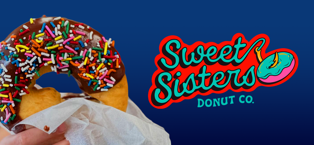
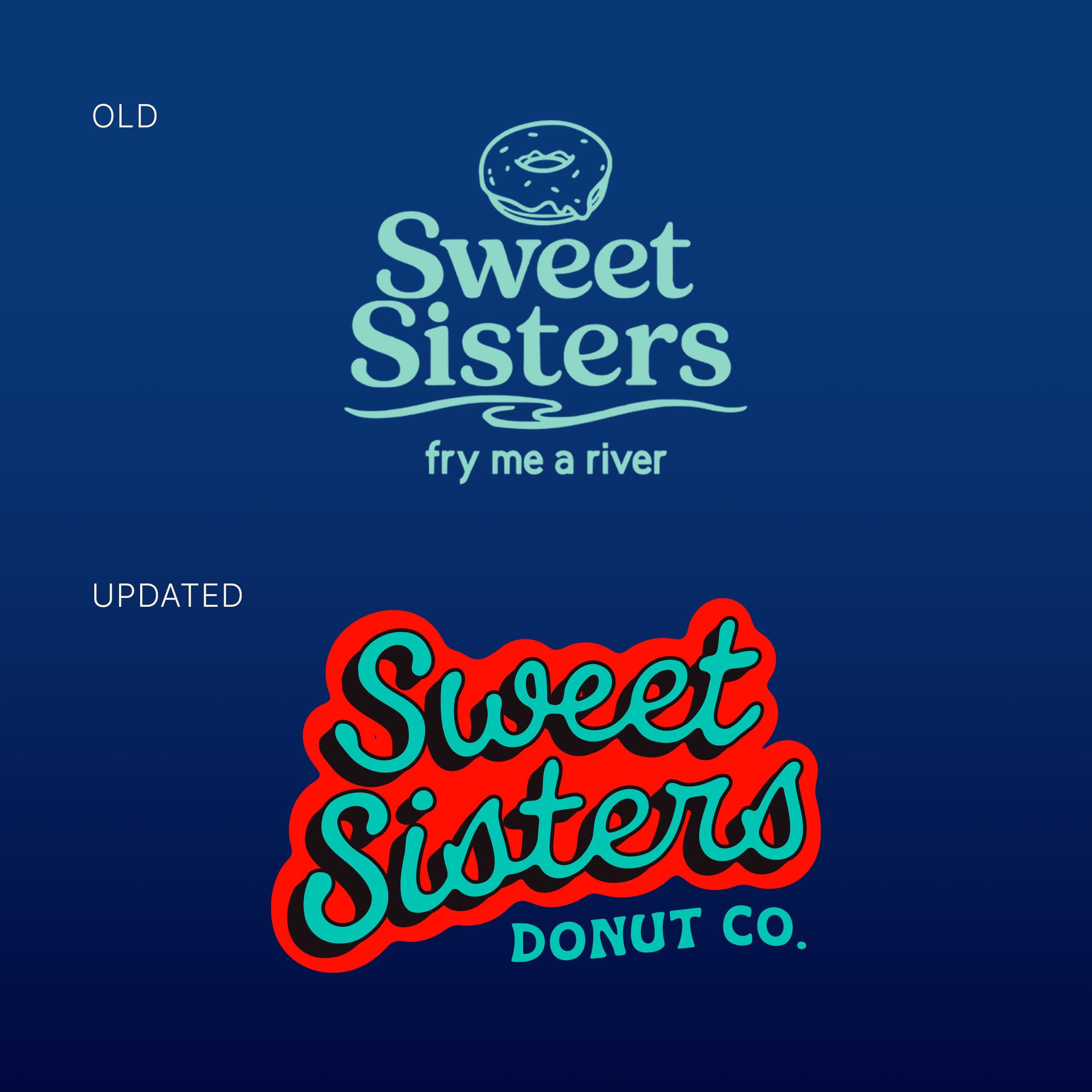
Sweet Sisters came to me looking for graphics for their food trailer, but their existing AI-generated logo didn’t capture the story behind the business. I built a visual identity rooted in their commercial fishing heritage, family-run spirit, and playful “Fry Me a River” tagline, creating a brand that feels distinctly theirs.
Inspo and Design
The identity draws from commercial fishing, sailor tattoos, and the humor behind their tagline, “Fry Me a River.” I wanted it to feel distinctly Alaskan and handmade without relying on the expected rustic or overly “Alaska” aesthetic. Instead, bold graphics, playful illustrations, and a little attitude give the brand a youthful personality, while fishing-inspired icons become characters within the visual system and the donut becomes the catch of the day.
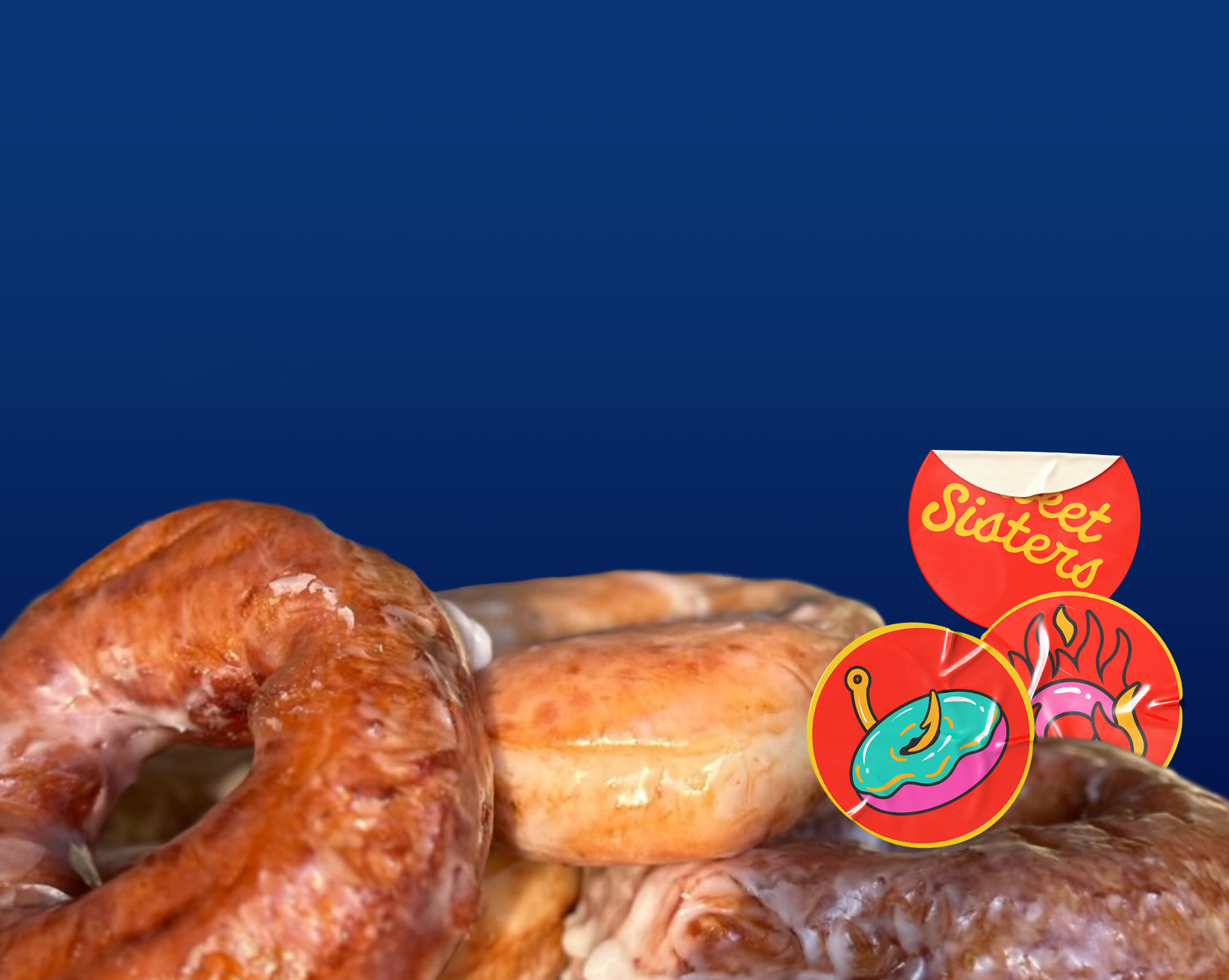
The identity was designed to grow with Sweet Sisters, from their black food trailer and decals to packaging, menus, merchandise, and social media. With a small-business budget in mind, the system gives them a strong visual foundation they can launch with now, without needing to invest in everything at once. As the business grows, so can the brand, adding new applications and touchpoints while keeping the same recognizable personality.
I love collaborating with passionate people who bring their ideas to life. Whether you have a small spark or a big vision, let’s create something amazing together—reach out anytime!
Here are other similar projects:


